The design-studio provides to the site’s visitors with description of new project to create, design and develop an effective digital brand for sport social media.
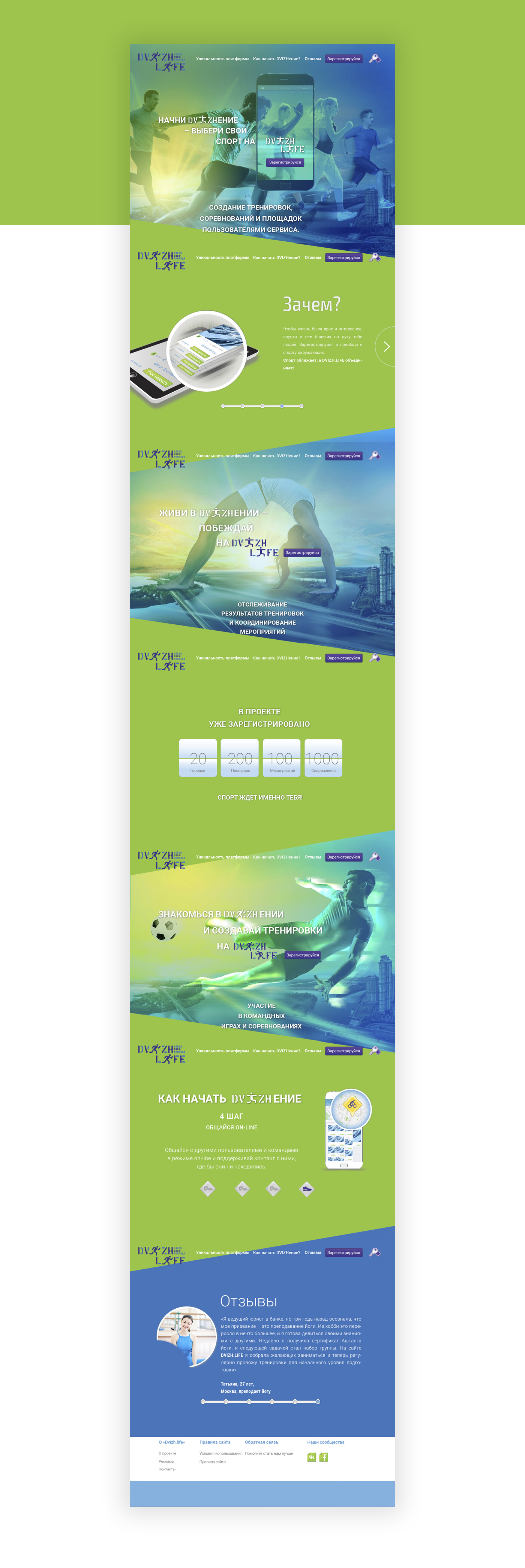
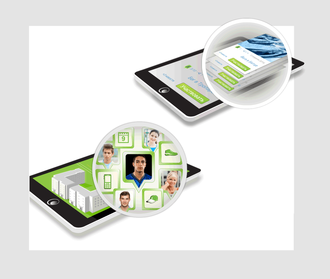
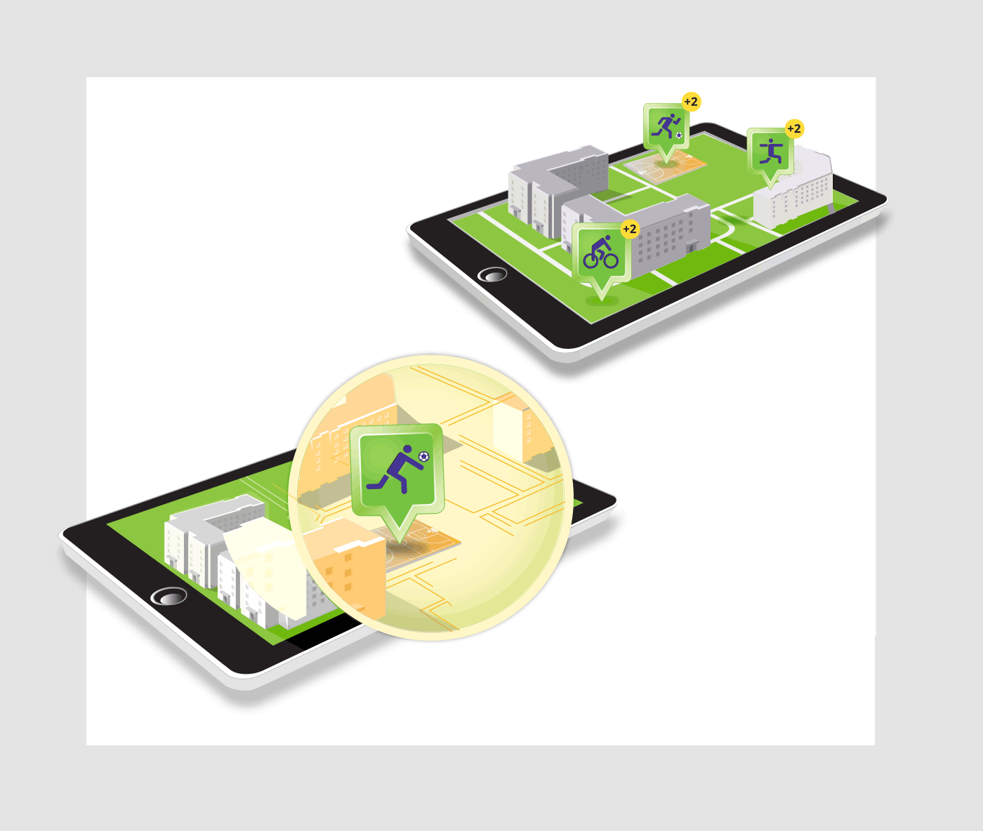
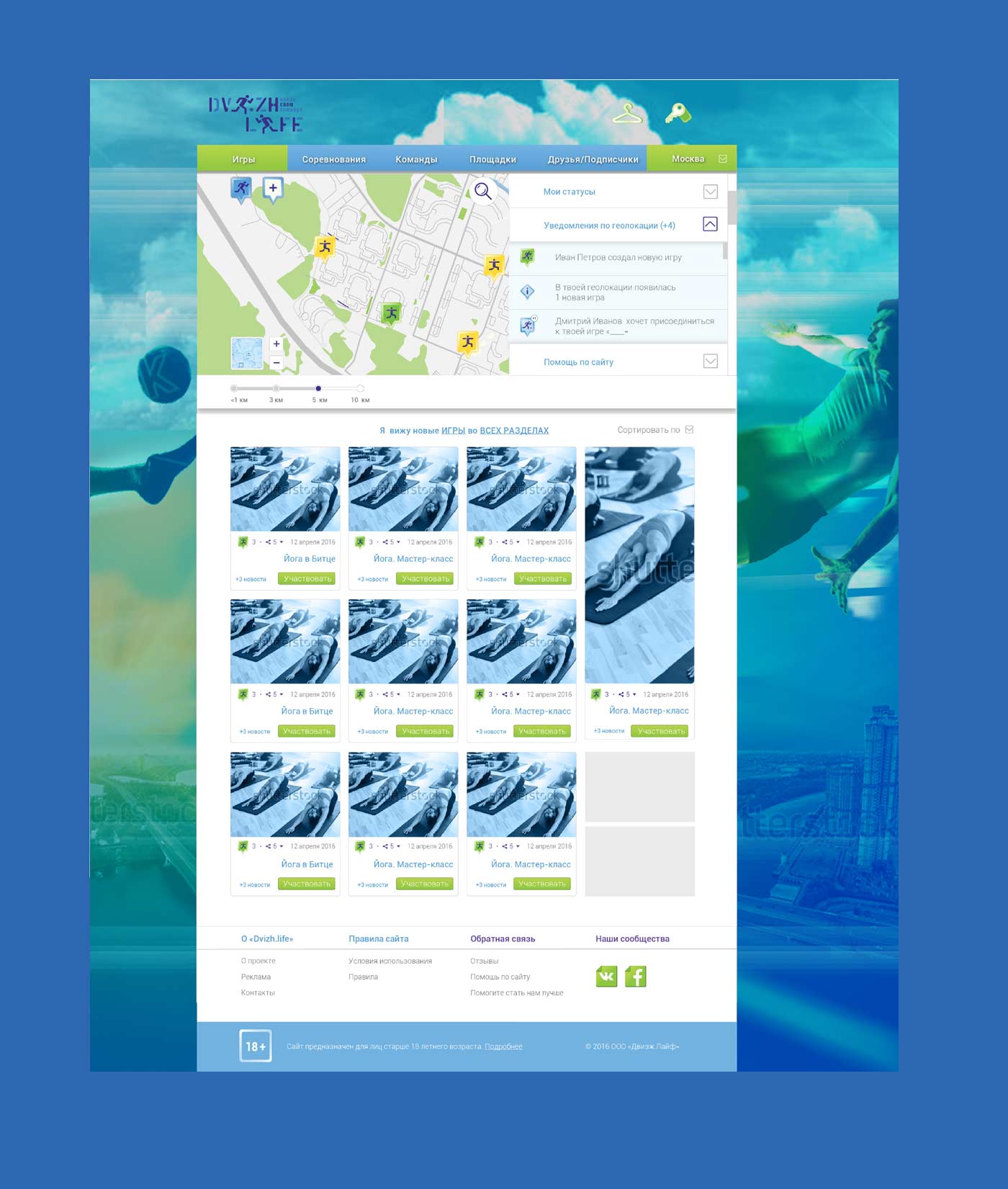
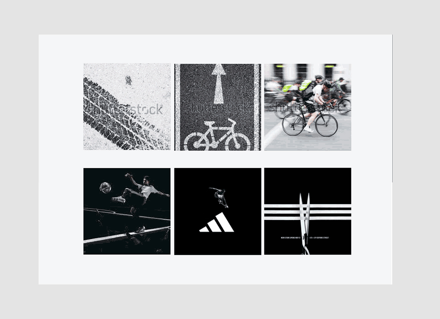
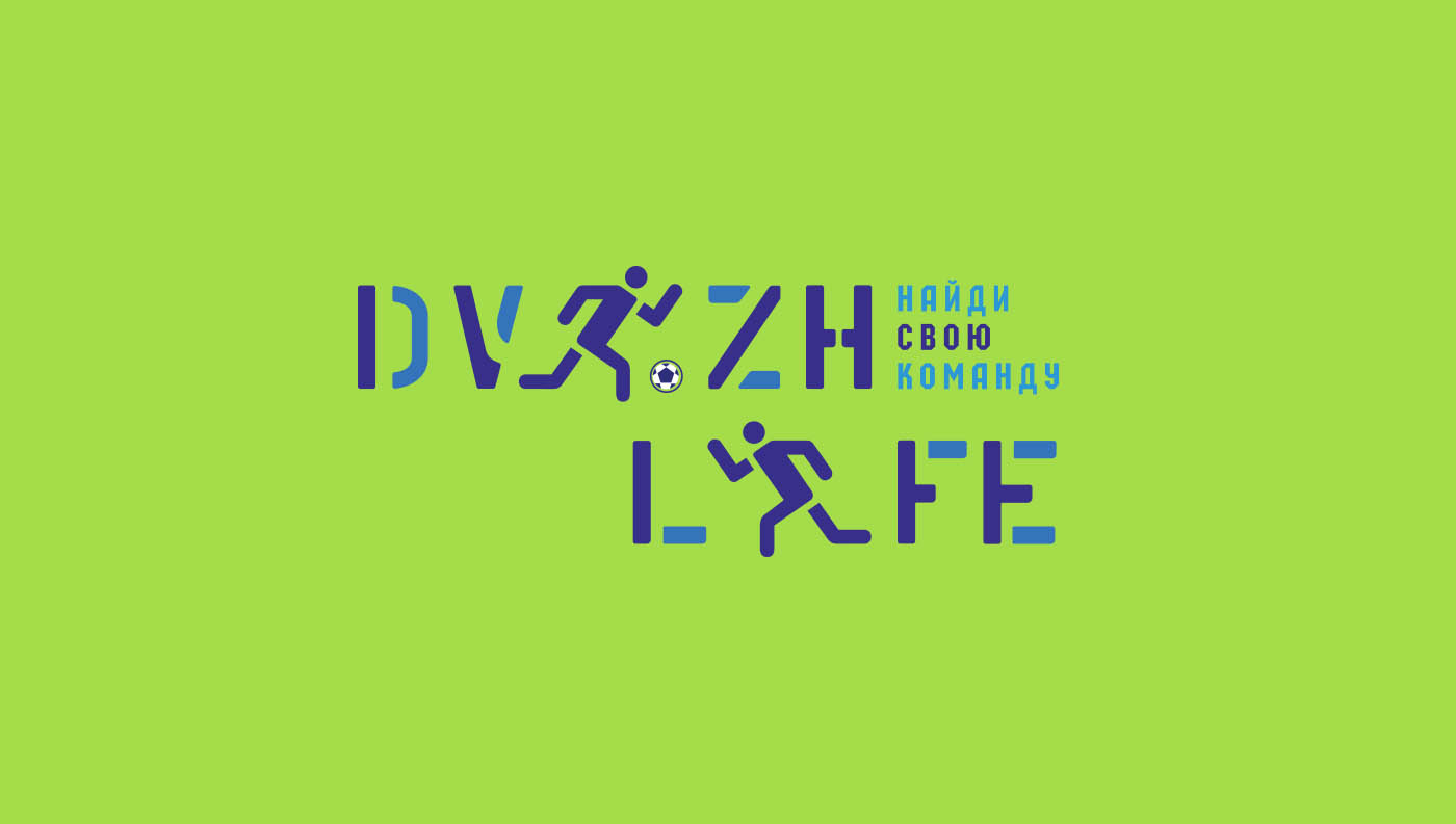
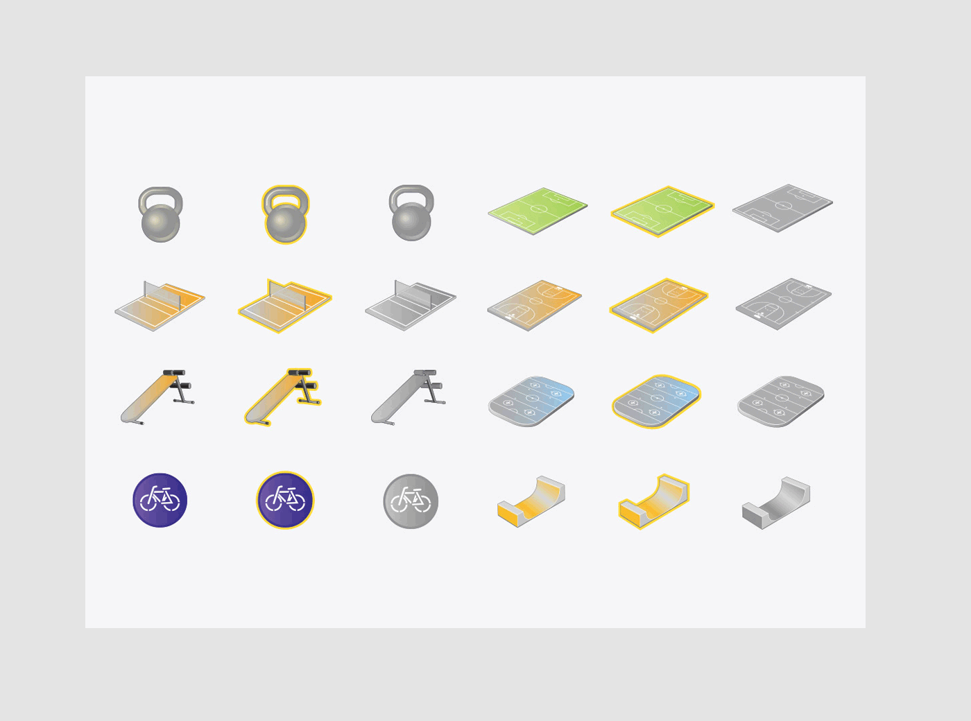
«DVIZH.LIFE» — is the service for navigation through sport city events with the aim of creating players network and organizing different sport events: workouts and competitions. For the project’s start 11 kind of sport were chosen; there are bicycle, run, football, basketball, volleyball, skateboard, yoga, rollers, hoсkey, boxing, jims. We had to develop new application with tools and ways to work and organize different sport team city events. The main tool of app’s navigation is a map with several kinds of tags shows new workouts, plays, competition and players status in a city and closed district.
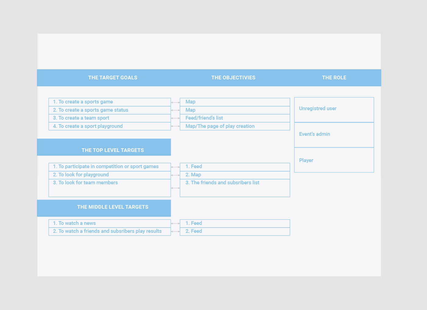
The first step was ergonomic developing, information structure and app’s navigation. We have to list and analyze user’s drivers and barriers and define their value.
Tags: B2C, branding, digitalbranding, identity, logotype, web design
We picked out the following items:
- User’s barriers:
- There no people close to my home with common sport interests.
- there are no free time;
- the age;
- the sport skills;
- there are no tool for coordinating team’s member;
- difficult to find convenient time and place for a team members.
- User’s drivers:
- I would like to find friends and create a team;
- I would like regularly to play sport team;
- I would like to create collaborative sport network;
- I would like to take a part in sport competitions.
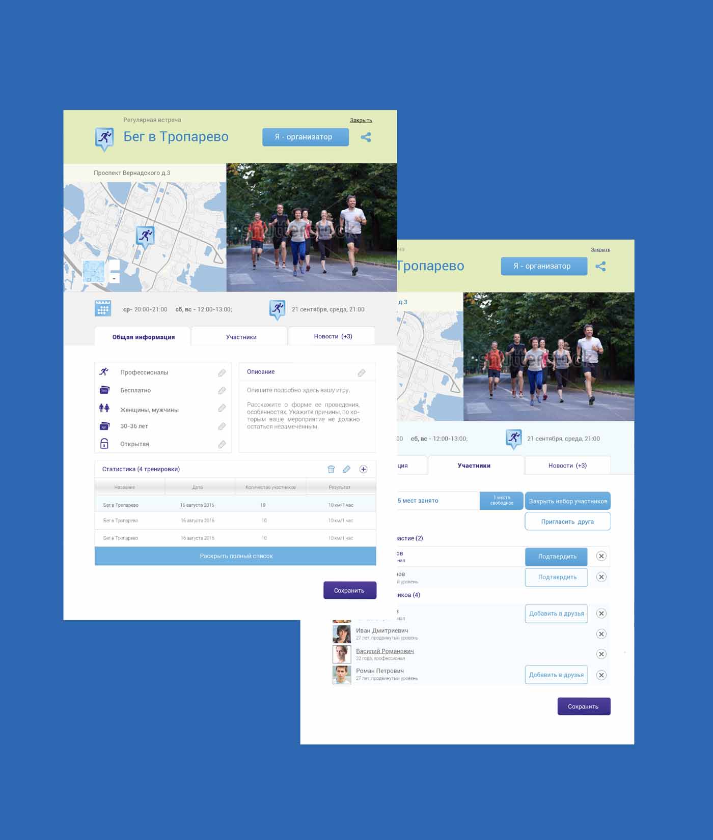
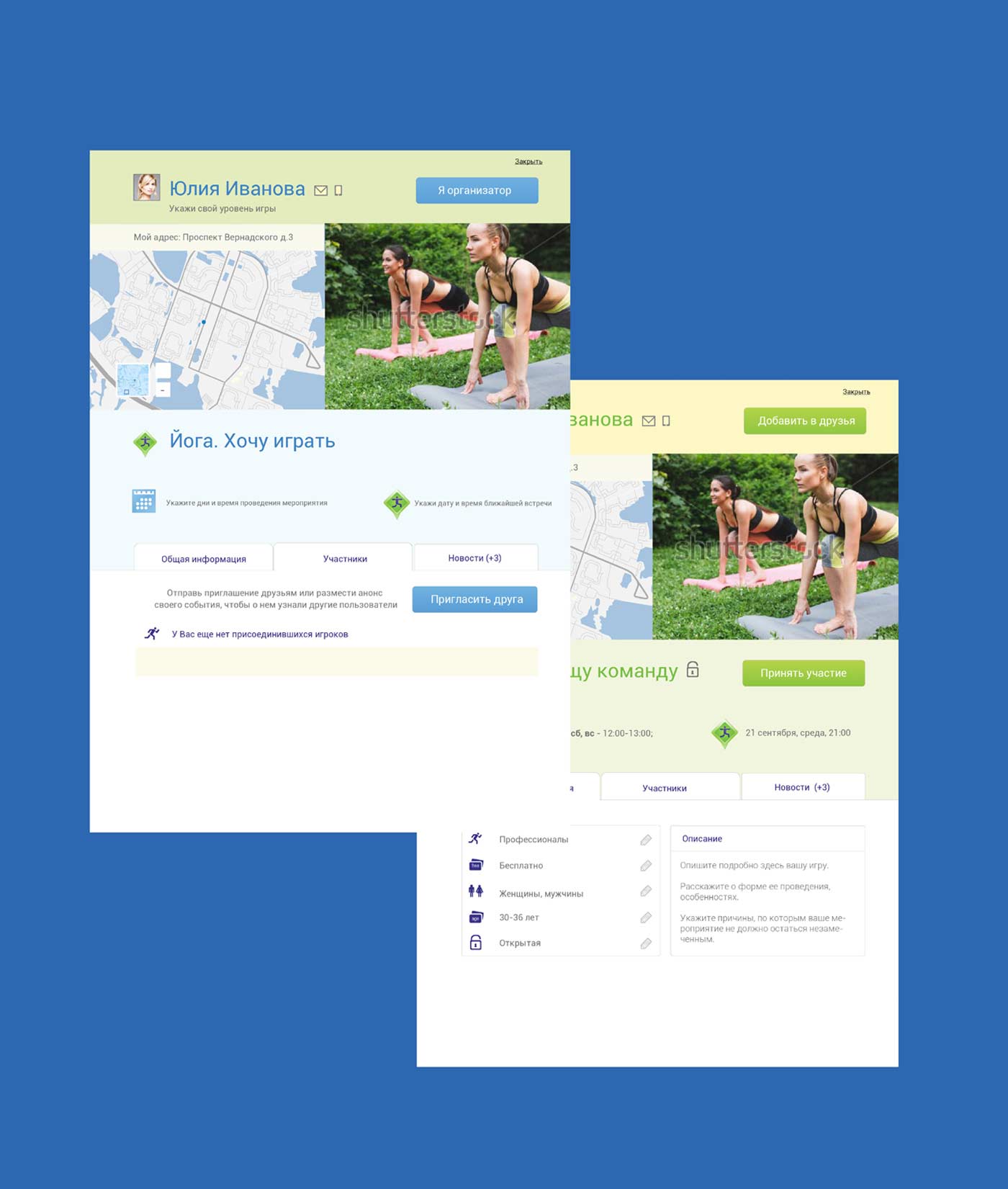
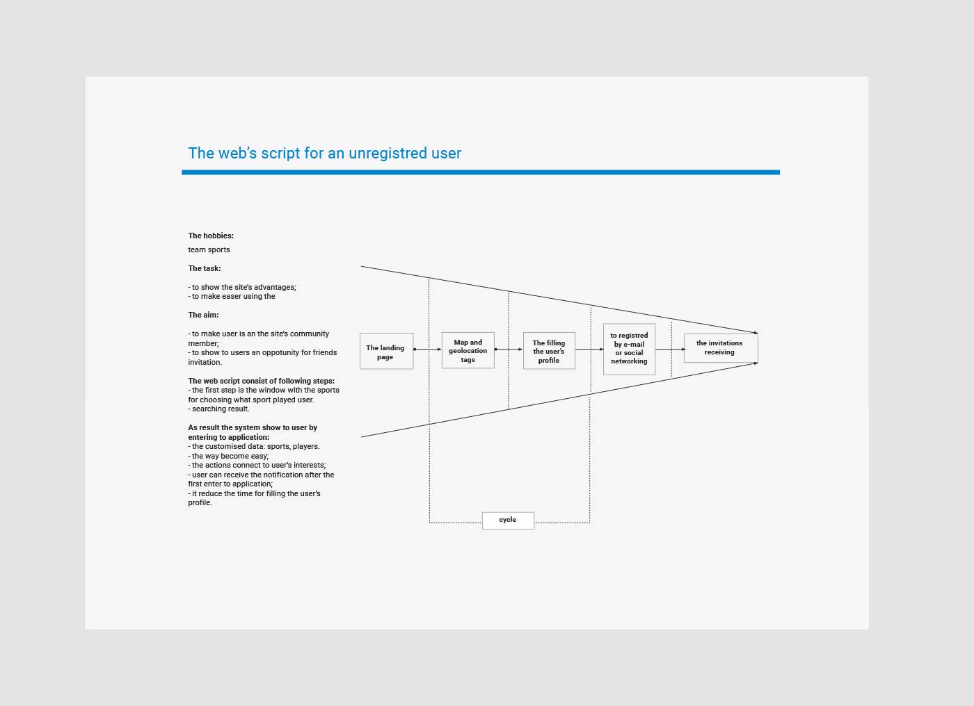
A basis analysis enables us to offer decisions to improve user experience, to integrate them into application architecture: to define the target-action list and describe the user’s scripts for aiming the site’s goals, and describe web page UI elements and prioritized them. As result, the site’s prototype was created. It consist of 75 pages and show architecture, interface, and how web pages interface change the appearance depend on user role (“an unregistered user”, “a registered user” and others). It is designed for creative and full struck team developers to define the scope of works. The website prototype consist of the following pages:
1) a play’s profile;
2) a user’s status profile; I want to play;
3) a section «competitions»;
4) a profile of competition;
5) the team’s profile;
6) a page of creating the team;
7) a sport playground section;
8) a profile of sport playground;
9) a page for creating sport playground;
10) a user profile;
11) a player profile;
12) a personal area;
13) a main page before sign in
14) a main page after sign in
15) a map
16) a player’s profile

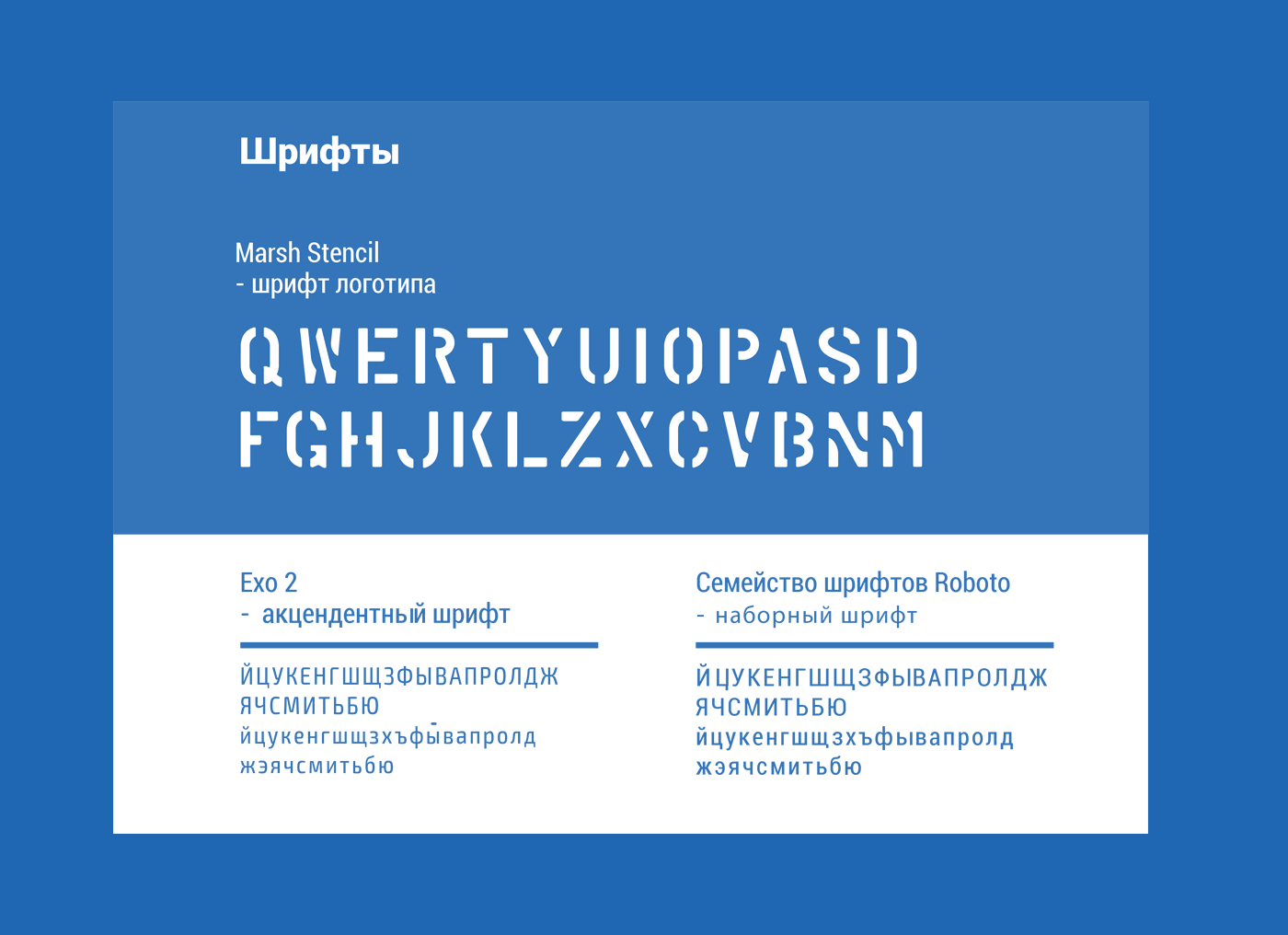
The big idea of new application is to navigations through sport events, communication idea is described by slogan «Start the moving, choose your sport on «DVIZH.LIFE»», visual idea is city environment and signs.
This visual identity uses a road signs and marking visual style what is determined app’s visual language: choosing the type, flat visual style, contrast colour combinations, with aim to make a noticeable a lot of different map markers on the small screens like road signs are always noticeable in replete informational city environment.
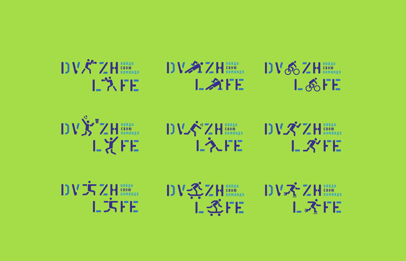
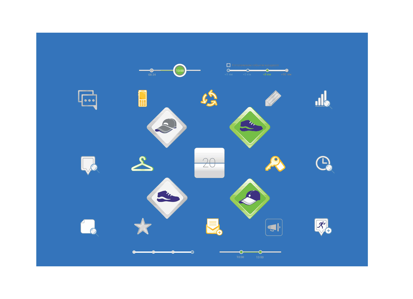
We create visual system for determining the different types of sport events and navigate through site’s data. The first step was to divide user’s statuses from workouts and competitions, assigned rhombus form of marker to first group and the square icon to the second group. The second task was to split two main groups on subgroups to show user role.
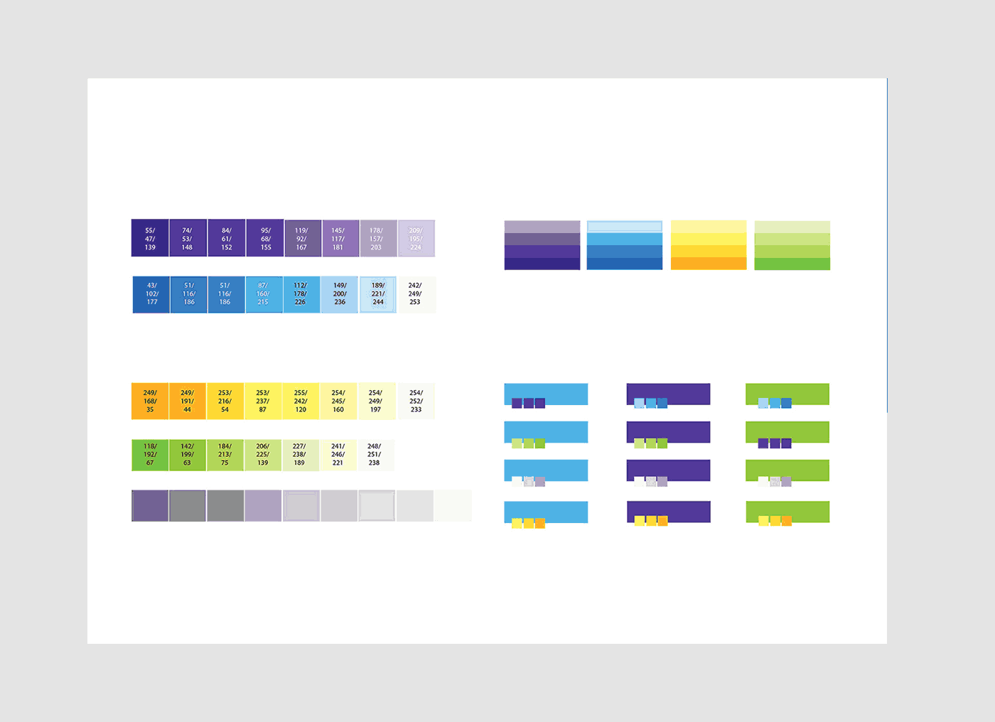
There are six markers groups were assigned by different colour and form:
- yellow colour for «events were created by another players and user haven’t took a part yet»;
- green colour for «events and statuses, which was administered by user»;
- blue colour for «events, created by another players and user has already took a part»;
- grey color for all types disabled events for any reason;
- the yellow underline for all type of events with cursor pointing;
- three types of additional markers – а) adding a new user in event, б) changing event status в) new mail or chat message.
The same colour identification is also used in web pages design. So, one page will change colour depending on the user’s role: “a participant”, “an admin”, “an invitation received”. After logotype and marker design were completed the next step was become design of inner and landing pages. The inner page must explain to new users the advantages of new social media, so, it was done with text and advertising illustrations use visual identity and markers with to make easy user experience after register in the application and make noticeable different UI-elements. The separate task was copywriting creating. An advertising copywriting and slogans were used on the landing page, the informational copywriting on the welcome page, registered page and windows.